Monday, June 13, 2011

Self Brochure

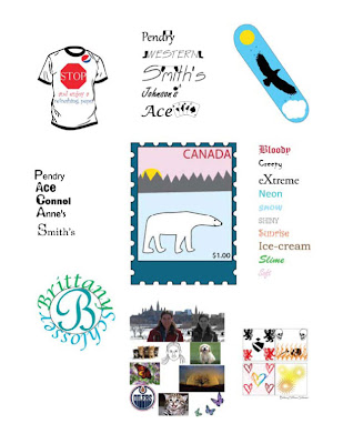
For this assignment we were to make a couple pages with our best work. Here are my pages.

Thursday, June 9, 2011

Self Portrait

For this assignment we had to get a picture of ourselves and then change it in photoshop. Then we were to take the same picture in flash and draw in the outlines of our own face. Then we were to put other pictures in. I used the picture of when I went to Ottawa. For the Photoshop changes I changed the colour to black and white. The other pictures I used were a couple kitten pictures, a puppy picture, an Oiler logo and some butterflies.

Monday, May 30, 2011

Flash Movie name


This is my flash movie. It is my name. For this movie I did my name in blue. It spells my name. As the ball hits the letters of my name the it turns red. This was actually a really easy assignment. It is a fun movie.

Thursday, May 26, 2011

Assignments left

I have 4 assignments left

Collage

It has been awhile since I have put anything on the blog. For this assignment we were to make a collage on photoshop. I was going to use my own pictures for the assignment but decided to use pictures that were already on the computer instead. The background picture is a field of sunflowers. I changed them to look black and white so that the animals would really pop. There is a lion in the field and it looks like it is running to come eat you or something. There is also a wild cat. I think it is a cougar or some cat like that. There is a grizzly bear roaring in the corner of the page. There is a giant butterfly there as well. Then there is a air plane that is flying away. all in all it is a really cool collage. I mean, where else would you find these things together.

Friday, May 13, 2011

Fireworks

For this assignment we were to make a movie on firework. My movie was called one day and it was 24 states long. It was to symbolize the fact that there are 24 hours in a day. There is a man walking his dog for most of the day. The dog has a pink collar and the dog is a redish brown colour. I can't upload it to my blog so hopefully my teacher looks at it on the drive.

Friday, May 6, 2011

Package Design


For this assignment we had to make a package using google sketchup. The package could have anything on it/in it. I chose to make it with a flower pot in it. The graphics I put on the side were the word flowers, a big flower and a logo I made for a previous assignment called Corporate Identity. The name of that company was bee's and butterflies flower shop. I then had to put it into a movie. It is a very short clip, but it shows my package. There is a purple flower inside the package. The animation is kinda jumpy because it was my first time using google sketchup. The animation is 24 seconds long. It shows the whole package. I used translucent sky for the roof and one of the sides has a kinda aqua blue and one side has green. The other sides are a clear glass. There is a very big purple flower on the other end.

Wednesday, May 4, 2011

T-Shirt

For this assignment we were to design a t-shirt. We could use media images if we wanted to but it couldn't be the whole design. I decided to make a t-shirt for pepsi. I went and got the logo and I put it the corner of the design. Then I made a stop sign and put the words ...and enjoy a refreshing pepsi. It is on a white background.


Tuesday, May 3, 2011

CD Cover

For this assignment we had to make up our own band name and make a CD cover for them. I chose to call my band Full Circle. I called it full circle because I felt that it made a lot of sense and If I had a band that is what I would name it. I felt that if you come full circle it means to me that you make something of yourself after you see something or when you grow up. I had to do a different CD cover with the theme as face. I kept the band name but now instead of a bunch of circles it has 5 faces. They are all women with different backgrounds and cultures. The have formed a band and I think the band name works because it says that the world has come full circle in the fact that we aren't as racist as before!

Monday, May 2, 2011

Skateboard/Snowboard

For this assignment we were to make a skateboard/snowboard. The theme was anything we wanted to make. The only condition was that it had to have a silhouette of some kind. The silhouette I did was a flying eagle. I then made the background of my snowboard a light blue like the sky, added a sun and a cloud.

3D logo

for this assignment we were to make a 3D letter and add something to it. I chose to do my first initial and a butterfly.


Friday, April 29, 2011

Corporate Identity

For this assignment we were to make a logo for a company. We were allowed to either choose a company or just make our own. I decided to make my own company. The name of my business is Bee's and Butterflies flower shop. My logo has lots of flowers and colour. It has Bumblebee's and Butterflies. I had to make three different logo's for the same company. The three logos all have flowers or are flowers. One is a circle and the other one is a square. The third one is actually a flower. It was allowed to be made in colour.

Wednesday, April 27, 2011

Monogram

For this assignment we were to make a monogram. We were allowed to make it on anything so I chose to make my name. I used a really fancy font and my two favourite colours: Green and Blue. I like that I was able to make this because I got to use my favourite colours and my name.


Tuesday, April 26, 2011

Lettermark

For this assignment we were to make five Lettermarks. We had a choice of businesses that we wanted to do. The purpose of this assignment was to make a design in the letter. I chose to do:


~Connel (key cutting)


~Pendry (flags)


~Ace (playing cards)


~Anne's (candle shop)


~Smith's (mitt's)

Monday, April 25, 2011

Farm Logo

For this assignment we had to design a farm logo. We got to choose from a bunch of different farm names and we had to make a logo for the said farm. I chose to do Sunset Valley Farms. The logo has a little house and a huge sun setting in the background. The house looks very friendly and inviting with smoke coming out of the chimney and a soft glow in the windows.

Wednesday, April 20, 2011

FG Letter

For this Assignment we were supposed to make a Figure Ground Symbol. I chose to do my Initials. We had to do a black and white as well as a colour. For the Colour I chose to do Blue and Green.

Tuesday, April 19, 2011

Canadian Flag!

For this assignment we were to change the flag to bring some sort of issue across. it was allowed to be funny or serious.
I chose to do mine on the current election. It questions the trustworthiness of the leaders and whether or not they care about average Canadians.
It is sort of making fun of the leaders and their attack ads and how they are beating the issues for commercial time. How the leaders are so focused on the other guy looking bad that they don't even care about telling people about their own platform!


Stamp Assignment

For this Assignment we had to make a Canadian $1.00 Stamp. We had to choose between 3 Themes. The themes were Sports, Culture, and Wildlife. I chose to do wildlife. For my Stamp, I did a polar bear walking around just as the sun is rising over the Mountians. It is a really cool picture.

Monday, April 18, 2011

Book Cover

For this assignment we had to take a book that we read and change the cover from the original. I chose to do HARRY POTTER AND THE DEATHLY HALLOWS. what I did with the cover is I made the deathly hallows symbol and left it on a black background. I like it because it is really simple but very powerful.

Wednesday, April 13, 2011

4 Seasons

For this assignment we had to make 4 scenes, each depicting a different season. The four seasons obviously are Winter, Spring, Summer, and Fall.
~For winter I did a snowman at the bottom of a hill with the sun setting and the sky looking like it could snow. There is also a nice pine tree.

~For spring I made a tree with new green leaves and flowers. They sun looks really nice behind the clouds and the grass is really green and new and fresh looking.

~For summer I made a beach picture with a bucket that has a couple shovels in it.

~For fall, I made another tree but this one has different brightly coloured leaves and a tire swing. The grass isn't as green and their is a pile of leaves. It is a very nice fall picture.

Friday, April 8, 2011

Blog Title Design

As you can see I have made my design to replace my existing blog Title. I made it so it has stars and swirls which are really cool and it has colours that I like and I think really work together.

Thursday, April 7, 2011

Newspaper Ad

For my newspaper ad I chose to make it for Eggo's Waffles and Mothers Day. It has lots of flowers and a breakfast in bed. They are going to feed their mother waffles.

Tuesday, April 5, 2011

Poem

For this assignment we were given the poem and we had to change it. I hope that it affects you the way I intended for it to happen. This poem is a very sad poem about how a girl goes to a party and doesn't drink just to be killed by a crazy drunk driver.

Monday, April 4, 2011

Word illustration

For this assignment we were supposed to create 10 words using word. We were not allowed to change the word so it was really interesting. The words I chose to do were:

  • Bloody

  • creepy

  • eXtreme

  • neon

  • snow

  • shiny

  • sunrise

  • ice-cream

  • slime

  • soft

Wednesday, March 23, 2011

Bug assignment

This assignment was to make the word of the bug using just the bug or insect in question.
I choose to do Butterflies.
I choose butterflies because butterflies are awesome and quite easy to draw.
The butterflies are blue with green spots and green with blue spots because those are my 2 favourite colours.
The other reason I chose to design butterflies is they can fly wherever they want and they are very free.

Monday, March 21, 2011

Trademarks

This assignment was to create trademarks.
We were allowed to chose which five we wanted to do.
The five I chose to do were:
  • Pendry (flags)
  • Western (cowboy boots)
  • Smith's (mitts)
  • Johnson's (music store)
  • Ace (playing cards)

Tuesday, March 15, 2011

Game Exercise

This is my game exercise. We had to create 10 designs. Those designs were:
~Design principle "Harmony"
~It is a whole bunch of Triangles
~Design principle "Balance"
~It is triangles and a square
~Design principle "Rhythm"
~It is a giant arrow of different coloured triangles
~The concept "Captivity"
~I did this on to represent creativity and colour as being confined, conformed and boxed
in.
~The concept "Freedom"
~ I designed so that the colours are free to go wherever they choose and it is very
disorganized and chaotic.
~Not conformed
~The concept "Love"
~A heart
~A Face
~Almost a clown
~A Human Figure
~it is a human
~An Animal
~It is an orange cat
~A Bird
~It is a chickadee

Thursday, March 10, 2011

Gestalt

this is my interpretation of gestalt theories.
I hope that you like them.
The five we had to do were:

  • Proximity
  • Figure Ground
  • Closure
  • Continuation
  • Similarity

Thursday, February 24, 2011

Design Principals~ Death, Love, and Sunshine

For this assignment we got to create our own designs using shapes that were supplied for us.
We had to do four different designs.
The four designs I did were:
Medieval~ I used Dragons and A shield to symbolize courage and bravery but in the end the dragons won.
Death and Destruction~ I used flames and skulls to symbolize death and it is going on the same lines with the dragons. The skull is burning because the knight failed in his mission.
Love~ I used five hearts. Four of them are in colour and the middle one is multi coloured because love isn't just one thing or one colour. It is multi leveled and dimensional. It can't be defined.
Sunshine~ I did a design on sunshine because I really like sunshine. Sunshine is awesome and it's happy. People are happier on sunny days and summer is my favourite season.

Pictograms

These are my Pictograms.
We had to design 15 pictograms. There were 3 categories and we had to design 5 things from each category.
The 3 categories were animals, man-made objects and transportation.
For animals I chose to do bear, cat, rabbit, moose, and dog.
For man-made objects I chose to do pencil, ballpoint pen, scissors, hammer, and alarm clock.
For transportation I chose to do bicycle, pick-up truck, school bus, jet plane and sail boat.


Occupations

This is my occupations design.
I had to make 4 different occupations.
I chose farmer, priest, musician, and own choice for which I chose to do traffic cop.

Man-Woman

This is my second design.
It is a design that shows 4 different people.
A man, a woman, a boy and a girl.

My First Design

This is the first assignment I did in Design class.
It is called Swan Valley Springs.